Posts

Showing posts from July, 2007

Contemporary painters of seascapes, beaches and the coast

Image
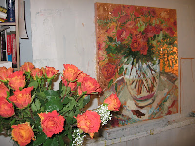
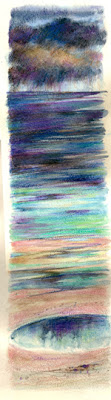
Having looked at a couple of painters of flowers I like recently, I thought I'd look at some of the contemporary artists who paint the coast that I admire. David Tress : http://www.davidtress.co.uk/ copyright David Tress I love the abstraction of his work, forms dissolve into pure marks and drama. The wildness of the sea is beautifully evoked by the dramatic slashing use of the paint. This is how Cornwall was in the winter, where I lived as a child, the wildness, the weather and the danger are all there. Neil Pinkett : http://www.neilpinkett.co.uk/ copyright Neil Pinkett I love his use of colour and the way that he simplifies elements to the essentials. Kurt Jackson : http://kurtjackson.com/ copyright Kurt Jackson I've mentioned his work before - just a couple of times! - but I love the drama and movement and terrific sense of place and the exciting use of paint and marks in his work. Ross Loveday : http://www.rossloveday.co.uk/ image copyright Ross Loveday I love th

Valerie Butters

Image
copyright Valerie Butters My own interest in flowers tends to be to close in on the centres, rather than to produce a still life set up - but I love the work of Canadian artist Valerie Butters. I'd like to own one of these :) (and a Shirley Trevena too please :) ) She works loosely in acrylic and produces large exuberant paintings, with drips and splashes and masses of energy and excitement. She often plays with perspective, distorting shapes and frequently taking a slightly offbeat view of her subject. Whilst they are loose, they are also well observed and she uses colours beautifully. She has a blog where she talks about works in progress and her exhibitiions and you can see more of her work and links to galleries. http://valeriebutters.blogspot.com/

Shirley Trevena

Image
Having mentioned Shirley Trevena previously and not having done any work at all for a couple of days, I thought I'd talk a bit more about her and show you some of her work. She uses watercolours in a very contemporary and innovative way. Her work is vibrant and colourful, it glows. She isn't interested in a botanical illustration of her subjects but in catching the spirit of them, the drama and the colour. Her compositions are offbeat with a geometric element superimposed on loose flowing subjects and the results are distinctively her own. I love the way that, like me, she uses sticks and unconventional mark making tools to achieve the results she wants. One thing I learnt, reading her books was the technique of sandpapering watercolour pencils into a wet wash to make beautiful speckled marks - that's something I'll definitely find useful. She's written 2 books on watercolours, illustrated with lots of her work, she takes you through a painting stage by stage

Digital Images

Image
We've been busy with my husband's family over from Ireland which means no painting, so I thought I'd show some digital images done using photographs and scans. I like to use the computer to work through ideas for paintings and to create images that exist in their own right. These images are part of a series I did on my daughter. all images copyright Vivien Blackburn The first one is about a time in her life when she had to decide whether to give up a hated psychology degree half way through and change direction in her life - a younger, more carefree Her looks on. She did leave and went on to complete a law degree. In the next image she was working, doing a law degree and was constantly having to watch the time, timetable activities, meet deadlines in time ..... In the following one I combined a picture of her with part of a painting by Dante Gabriel Rosetti - integrating them and providing modern equivalents for the accessories shown. I'd taken a photo of her ru

Empty Easel

Image
a page from a sketchbook - nothing to do with the following post but I thought I'd put a picture in so it isn't all text :D Dan, who writes the interesting and thought provoking blog, Empty Easel, has featured me this week - it seems to be my week for featuring! Leicestershire and Rutland Life, Making a Mark and now Empty Easel! Thank you Dan and for the real insight you showed into the Time and Tide series :D http://emptyeasel.com/ anyone who hasn't discovered Empty Easel - do take a look, it's a not-to-be-missed blog full of interesting articles. The Time and Tides have been delivered and the show starts on 4th August. I don't think I'll make the Private View due to other committments but I'll try to get over to see how they've been shown and take some photos.

Time and Tide update

Image
Lavender Marsh, Dusk all images copyright Vivien Blackburn I'm afraid these photos didn't come out brilliantly and they don't show all the colours. The first one is of the marshes when the sea lavender is in bloom and they have a lovely purple haze. There are sludgy greeny and mud colours in there that aren't showing well and nor are the subtler changes in the rain on the horizon. This was based on a time when I was there at dusk on a day with a wonderful towering threatening sky and an extremely high tide. Jade, Misty Morning This one is based on a day when we'd travelled over through thick mist, which started to lift as we settled to paint - it was a beautiful day once it cleared, this shows the last of it when everything is in soft focus. This is the group I'm taking for the exhibition, final selection. The seasons change - cold winter mornings, moonrise, sunset, windy blue days, cool afternoons, sunny days and throught it all reflecting pools and the

imagekind

Well Katherine your blog posts on Imagekind inspired me! it was such a gloomy horrible day with heavy rain and thunder and thick black clouds - and the light was lousy for painting - so I decided to make a start at Imagekind NOW rather than later! I decided that in for a penny in for a pound - the choice seemed to be between free or platinum - if I was going to pay then that was the best deal. So I've signed up for a platinum :) I don't know how it will go - will I sell? time will tell. It does mean that images are affordable, I can include sketches and paintings that have been given as presents to family members and work whereI don't want to sell originals. anway here is the link http://vivien.imagekind.com/ and there is now a shiny new button on the right hand column :)

my first glossy magazine article!

Image
:D they'd promised to send me a copy of the magazine and it came today Leicestershire and Rutland Life, a glossy magazine had asked me if they could do an article on my work and do this double page spread .... so here it is :D and the text by Becky Jones below, you can double click on the images below and it is then readable if you are interested :) I have to admit I was a bit nervous about what the article would be like! had I made sense in the interview? I do wish now I hadn't given them that red clouds seascape as I think I want to change it a bit! it looks rather garish there? I gave them some quieter, moodier ones too but I suppose they were looking for lots of colour. Today the weather is dark and rainy and the light is awful so finishing off the edges of the canvasses is on hold - there's severe weather warnings and more floods in lots of places - and all this after they said it would be a record breaking hot summer!

an alternative approach to still life

Image
Done on a full size watercolour sheet, so large This is a VERY old still life from at least 15 years ago, before I did my degree, so I'm not holding it up as a great painting! It was done in an adult ed class and the tutor had provided a pile of interesting objects on a table. We had to select one, take it away and paint it on a large sheet of paper - then return, select another and add it somewhere. It is NOT meant to read as if it was a set up arranged this way but as a collection of interesting objects which could be linked - for instance all art equipment - but needn't be.It was in response to the work of Elizabeth Blackadder who tends to work this way. The objects didn't have to be to scale with each other we needed to consider the final composition as we added each one - how to integrate them? how to move the eye around the composition? how to balance the composition colourwise, sizewise etc I used the pattern of the cutwork cloth, one of the items, and the beads t

what is a still life - part 2 looking at artists work - and a new seascape

Image
Wild Day copyright Vivien Blackburn mixed media on paper An unfinished painting I came across and finished off today, after painting the sides of some of those @&2+**@ canvasses - I HATE that job with a passion and usually keep up to date with them - but this time they were all 'in progress' and so all need doing :( This was watercolour, oil pastel and coloured pencil, I added a touch of acrylic and it was finished. Following on the last post I thought I'd look at contemporary still life that I find interesting and see what sort of objects they are using, what media and how they treat the subject. First of all is Shirley Trevena - exciting, dynamic and vibrant watercolours with touches of mixed media. I love the excitement and buzz of her work, her glorious colours, her distortion of perspective, overlapping elements, tipping up tables or plates if it works to make a better painting - a delicious explosion of colour. You can see her work on http://www.shirleytrevena.c

what is still life? and some old work

Image
What constitutes a still life? I've been discussing this with Katherine and others and there are several opinions from a very narrow view to more inclusive ones :) Still life is a relatively new genre - it was a humble subject, reserved for items in backgrounds for most of art history, designed to show the possessions of the sitter for a portrait for instance. I won't go into the development of it because I think Katherine at http://makingamark.blogspot.com/ will discuss that and provide some very good definitions from various authorities - each a little different :) and links. It tends to be one of the first subjects new painters tackle and is frequently used in beginners classes and there it tends to be done in a very traditional way, with formal set ups, worked on over several lessons. It can be imagined that this is all there is to still life - it isn't - Still life is incredibly difficult to define - it covers such a wide variety of styles, media, subjects and concep

playing with watercolours

Image
all images copyright Vivien Blackburn Today I felt like a break from the big canvasses and a 'play' with watercolour and flowers. The weather isn't good so I looked at my sketchbooks and worked in watercolour from sketches I'd done some time ago. I was in the mood for the lovely way that watercolour bleeds and flows, which is very much the way I started on the big seascapes. I hadn't done much watercolour painting lately and I really enjoyed it :) The first image is based loosely on a mixed media/collage painting which you can see here http://www.vivienblackburn.com/flowers.html - interpreting it in a different medium exploits another range of marks and possibilities. All of these images incorporate a little coloured pencil. The third is from a sketch of an oriental poppy I did in a friends garden - I did a large mixed media version of it some time ago so the image may seem familiar. I used a Chinese brush, bamboo pen (to pull out lines of wet paint and to scratch

Scottish Painters

I've liked the work of contemporary Scottish painters for a long time and a conversation with Katherine about talking about those we like triggered this post. I'm sure she'll come up with a very different and equally interesting selection - and I know hers will inlclude Blackadder, so I'll leave Katherine to talk about this her work :) The 16 seascapes I'm in the middle of are ongoing, you've seen the finished ones and the others are wet and still in progress (but very nearly done except for that horrible endless task of painting the edges :( ) S0 .... it seems a good time to look up those Scottish artists I like and provide some links. The Manor House Gallery in Stow on the Wold specialises in Scottish painters and shows many of those I like. http://www.manorhousegallery.co.uk/ - skim to the bottom after you've looked at the paintings shown and click on links to their other artists - they've got some lovely work - with this gallery I love the work of

Memories and Influences

Image
Oh dear blogger is really playing up - it won't let me title this post and I noticed someone else complaining about that a couple of days ago. (oh now it has). Yesterday it wouldn't let me publish - yet sent the post out to subscribers! I wanted to call it memories and influences. It's in response to an article by Lindsay http://straightlinesout.blogspot.com/ about the earliest influences on her art and the fact that she moved around causing her to have deep feelings about her area and put down roots in response. I too moved around as a child. My father was in the RAF, in Coastal Command, and we lived in Gibraltar when I was small - my earliest memories are of sitting in my grandmothers garden in England when I was one. I can date it because it was before moving to Gibraltar. There are no words but I was sitting on the lawn on a rug in the dappled light from the tree and I loved it. I remember the vivid blues of the sea and the flowers in Gibraltar and our street

interesting blogs and work

Image
I've taken a few days off painting to catch up on a million and one other tasks so I thought I'd share some of the artists who blog and that I read regularly. I'm mentioning them in alphabetical order as they come up on bloglines. There are others but I can't list them all ! As it is you can see that I spend too much time on the computer! .... well it's better than Wimbledon, football, racing, you-name-it that himself is watching. First off Anita http://am-art.blogspot.com/ who does the most beautiful work in pencil and pastel. I was first amazed by the cutlery she drew in pencil and her current series of pastels, used in rather un-traditional way have an incredible presence and mood to them. Patrice http://aquamarelle.blogspot.com/ who not only handles watercolours brilliantly but catches the excitement and drama and movement of sailing equally brilliantly. Derek http://derekjonesart.blogspot.com/ who paints the figure and also recently has done a beautiful se

approaching storm

Image
a different scale for this one :) it's only 15 inches tall in watercolour and coloured pencil - another in the Time and Tide series. details: I need to do some work in pastel on the theme of Reflections . The Pastel Society have a show on the theme in August I believe and I need 2 paintings in pastel. We're allowed to use mixed media as long as the major part is done in pastel so I'll probably underpaint in watercolour or acrylic. Reflections could be viewed in a lot of different ways - meditative reflection rather than simple mirror like actual reflection for instance - but it will suit me if what I do fits in with a body of work that I have ongoing, rather than an isolated image that won't be shown anywhere else, so it's likely to be either a waterways or seascape image.

Bird in collage and mixed media

Image
Sorting out some stuff in my studio I came across this little collage I did ages ago and decided to use a little coloured pencil on it just to bring it together. I'm quite pleased with it and I'm going to mount it on canvas and varnish it to protect it. I think I'll probably paint the surrounding canvas black though - I'll leave a border showing like here. It's about 8 x 5 ins guesstimating. Here it is on a black background - what do you think?

Fuchsia sketch and back to work on the seascapes

Image
a quick sketch of a fuchsia in sepia ... and now it's back to the seascapes as himself has made me up 4 more long thin canvasses :) I just want to do a few more in the series and then it'll be back to another format. I have some square and nearly square canvasses waiting :)

Time and Tide - together :)

Image
all images copyright Vivien Blackburn This is the series that I have at the moment - they are all to scale and it gives an idea of how they work when hung. The tallest is 50 inches and the shortes 35 inches - widths vary from 8 ins to 12 ins. Windy Day 12x42 inches In this one I tried to catch a fine windy day, where the surf is pounding in and the reflections are broken by the incoming ripples - it's exhilarating to be on the beach on a day like this :) I've still got some more to do and then it's on to slightly more usual canvas proportions. At the moment they are propped on top of the TV, in front of bookcases and along a sofa in the living room so that I can see if anything wants adjusting - and all those edges need painting in a soft neutral creamy colour :>( - a mammoth task! ...... I wonder if my husband would ............................. no, I think that's hoping for too much! :>)